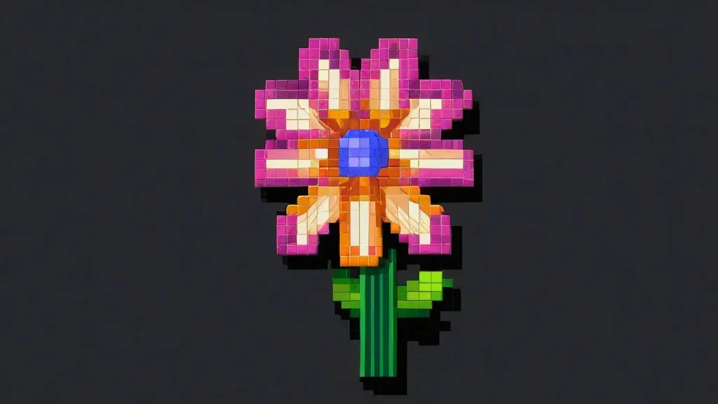
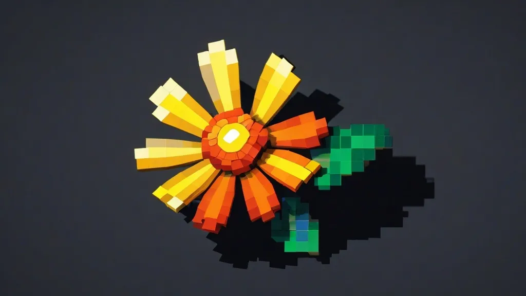
As someone who has spent 12+ years building sprites, logos, and those cursed giant eyes that stare over spawn, here’s the quick version. If you want clean results in pixel art minecraft, pick a small block palette (8–12 blocks), use a simple grid, and stick to your reference like glue. No fluff. Just make it readable at a glance.
In my experience, the fastest wins come from two things: great palettes and ruthless scaling. I’ve watched people slap 40 block types into one sprite. It looks like a melted candy store. Start small. Get contrast right. Then add flair.
Quick Answer: How I build clean pixel art, fast

- Pick a reference sprite or logo. Keep it under 128×128 if you’re new.
- Make a grid in Creative mode. One pixel equals one block. No “kinda sorta.” Exact.
- Use 8–12 blocks max. Mix concrete, wool, terracotta, and sometimes glazed terracotta for texture.
- Place outlines first in black or dark gray. Then fill mid-tones. Highlights last.
- Stand back every 20 blocks. If it reads from far away, you’re winning.
I’ve always found that people overthink tools and underthink values. Contrast beats detail. If a face reads at 50 blocks away, the rest is bonus.
For context, the core of classic pixel art is “tiny squares make pictures,” which is explained nicely here: pixel art basics.
And yes, Minecraft is a blocky sandbox where all this becomes very hands-on. If you want the official rundown, here’s the game page: Minecraft.
Pixel vs. Voxel: The tiny truth that saves builds
Pixels are 2D. Minecraft blocks are 3D “voxels.” That matters for shading and edges. If you’ve ever wondered why your flat art looks weird at an angle, it’s because blocks catch light. You’re painting with cubes. Read this if you like terms: voxel.
What I think is funny: everyone calls it pixel art, but we’re doing voxel illusions. It’s fine. Language is lazy. Builders are not.
If you’re into how retro style and modern design collide, I liked this write-up on exploring indie pixel games. It’s not Minecraft-specific, but the color logic carries over cleanly.
Block palette 101 (and why dithering is your friend)
Palette picks decide everything. I once rebuilt a 64×64 anime eye three times because my reds argued with my oranges. Now I build palettes first, and I test them on a 10×10 swatch like a sane person.
Here’s a quick cheat sheet I actually keep around.
| Block | Role | Where it shines | Notes |
|---|---|---|---|
| Black Concrete | Outline | Logos, eyes, high contrast | Flat, deep black. My default line art. |
| Gray Terracotta | Mid shadow | Skin, stone, metal | Warm tint reads more “alive.” |
| White Wool | Highlight | Shiny edges | Slight texture—great for soft sheen. |
| Light Blue Concrete | Cool mid | Ice, tech, water | Pairs with cyan terracotta well. |
| Red Concrete | Base color | Capes, logos, accents | Use orange terracotta to shade. |
Secondary tricks that help: dithering (checkerboard blends), anti-aliasing (soft lines using mid-tones), and slight hue shifts (shade red with purple, not just darker red). These are sprite art basics. Will save your build.
If you want the bigger gaming angle on why these old tricks still work, this piece on unraveling pixel art games lands the point pretty well.
Map art, schematics, and when to use tools
Confession: I don’t hand-place every pixel anymore. For big map art, I’ll generate an image-to-block layout, then paste it with WorldEdit on a private test world. After that, I hand-fix edges. It’s faster and, honestly, keeps me sane.
And if you’re wondering how a “pixel” works in the real world, Britannica’s little explainer is handy: what a pixel is.
For more inspiration across genres, I sometimes scroll the pixel games category when I’m stuck on a palette idea. Fresh eyes help.
Answers in one breath: common builder questions
Which blocks do I start with?
For 90% of sprites: black concrete, white wool, gray terracotta, light gray concrete, a warm shadow (brown/terracotta), a base color, a dark shade of that color, and a highlight version. That’s 8 blocks. Add two accent blocks if needed. Done.
How big is too big?
Past 256×256, you’re managing a mural, not a sprite. If you need something gigantic, consider chunk-aligned sections and plan for render distance. Keep it readable from spawn or your survival base path.
If you care about game history and impact, the quick overview here is useful: Minecraft summary.
Why does my art look different with shaders?
Because shaders add smooth light and shadows. That breaks the “flat” pixel look. If you want pure pixel read, test without shaders first. Then pick a subtle shader. You can also set your piece under a roof to control light.
I’ve toyed with strategy-style designs too. If that’s your jam, this guide to explore the vibrant world of pixel battle games hits layout and clarity—the same stuff that matters in sprites.
Mini-guides inside the guide
How do I pick colors that pop?
- Use warm shadows and cool highlights. Or flip it for a cold vibe.
- Shift hue as you go dark. Red to purple, yellow to orange, blue to teal.
- Test a 10×10 swatch. If it’s muddy, restart. Don’t argue with mud.
Isometric illusions with blocks
Want an isometric look? Fake it by stepping your lines 2 blocks over, 1 block up, repeat. Then soften edges with a mid-tone. You’re basically doing anti-aliasing in 3D. Looks fancy, costs little.
If you like browsing analysis and case studies, the visual game design category is a rabbit hole I enjoy falling into.
Map art vs. free-standing builds
Map art is for flat images that live inside a map item. Great for servers. Free-standing builds are sculptures that cast shadows and play nice with shaders. Both are valid. Both need simple palettes and clear silhouettes.
The game’s own page has more background if you’re curious about the base rules: Minecraft on Wikipedia.
Common mistakes I still see (and made)

- Too many blocks. Pick 8–12. The rest is noise.
- No outline color. Even a soft dark line helps sprites read fast.
- Flat shadows. Use hue shifts, not just darker versions of the same color.
- Building in bright sun only. Check at night and dusk.
- Forgetting scale. A 512×512 face is a horror movie up close. Plan for distance.
If you like hybrid retro-meets-modern takes, this guide on explore the vibrant world of pixel battle games also maps well to layout choices in big murals. Strong silhouettes win.
Redstone, command blocks, and small magic tricks
I’ve done blinking eyes with redstone lamps under carpet. It’s silly. It works. For swap-able palettes, command blocks can replace blocks in stripes so you can A/B test shades fast. Survival folks: pre-craft dye batches and farm sheep near the build. Your future self says thanks.
If you’re into the throwback-meets-today conversation, here’s another helpful lens: unraveling pixel art games.
Reference and research without the yawns
For the mail-it-in definition crowd, here’s the entry on pixel art. Good to have in your pocket when someone argues in chat about “true pixels.”
And if you care about why the whole blocky thing works at scale, take five minutes with this overview. It’s not flashy, but it’s clean.
If I’m hunting for ideas, I skim lists like this one on exploring indie pixel games to steal palettes—uh, to learn color wisdom. Yes. That.
When to go big, when to keep it tiny
Here’s my rule. If the art needs to be seen from spawn or a busy path, build 128×128 or more. If it’s for a cozy base wall, keep it under 64×64. Chunk-align your edges so you’re not fighting borders later. Also, back it with a solid wall to stop ambient light leaks.
Want to nerd a bit? Voxels are the reason your edges catch light differently than flat art. If that’s new to you, read the summary on voxels. It’ll click.
For browsing more styles quickly, try the pixel games category. I grab palette ideas there all the time.
Why I still love doing this
I like the limits. Limits focus taste. Give me 10 blocks and a tough sprite, and I’m happy. Some nights I’ll rebuild a tiny 32×32 mascot three ways, just to see which one reads best at 40 blocks away. Sounds boring. It’s not. It’s like tuning a guitar until it sings.
And yes, the term “pixel” is doing a lot of work here. If you want the clean difference explained, Britannica has a short page on the pixel. Worth a skim.
When I teach pixel art minecraft workshops, I start with a 16×16 sprite and make people build it twice—once flat, once with depth. The second version usually wins. Blocks love light. Use it.
Anyway. That’s the gist. Blocks, light, tiny choices, big read. That’s why pixel art minecraft still hooks me.
FAQs
-
What blocks should I use for outlines?
Black concrete for crisp lines, or dark gray terracotta if you want a softer, warmer edge.
-
How big should my first sprite be?
Try 32×32 or 48×48. It’s small, fast, and forces good color choices.
-
Do shaders ruin pixel art?
Not if you test without them first. Pick a soft shader and control the light around your build.
-
Can I do this in Survival?
Yes. Pre-farm wool and dyes, use scaffolding, and build a flat backing wall. It’s slower, but doable.
-
What’s the best way to learn palettes?
Copy simple sprites, limit yourself to 8–10 blocks, and do tiny A/B tests with hue shifts.
Henry Wright: Celebrating the artistry of gaming. I cover Pixel Games, Indie Battles, Arcade Classics, Gaming Culture, and Visual Design. Let’s explore the pixels together!


This article on sustainable fashion is very informative. I like the tips on eco-friendly shopping practices. What brands do you recommend?