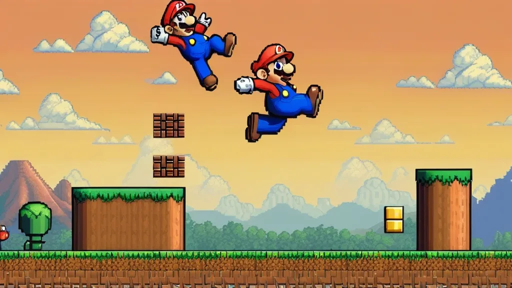
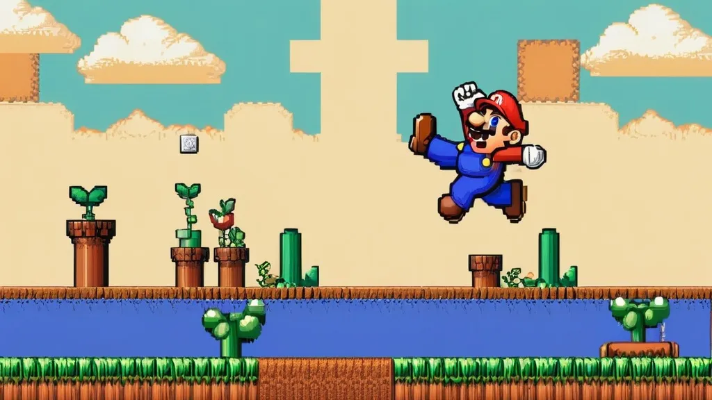
As a pixel artist and platformer designer who’s shipped small demos, modded old ROMs, and taught weekend workshops for 10+ years, here’s my blunt take: if you want Mario to feel right in pixels, you must nail the jump, the tiles, and the timing. That’s the whole trick behind pixel mario, plus the charm of 8-bit sprites and retro level design. Sounds simple. It isn’t.
When people say “pixel,” they often mean the art style. But it’s also the rules underneath. If you’re new, skim the basics of pixel art so the jargon doesn’t smack you later. Pixels are tiny; your choices are not.
Why Mario works so well in tiny squares

In my experience, the magic is not only the plumber. It’s the feel. The jump arc is smooth, but with snap. Acceleration, deceleration, gravity. You can stop on a dime more than in real life, because fun > physics. I’ve always found that if the first hop feels wrong, the whole game feels wrong.
Also: sprites. The little pictures that move on the screen. We used to make and store them in sheets. If you’re curious about the term, here’s a plain explainer on sprites and how they’re drawn, layered, and animated. Without clean sprites, your character blends into the background. Goodbye clarity.
Old hardware tricks that still matter today
- Readability over detail: Big shapes, strong silhouettes, limited colors. Fancy shading can wait.
- Tile-based levels: One 16×16 block reused a hundred ways. Your brain says “cheap,” your eyes say “cohesive.”
- Consistent rules: If a block breaks once, it should always break. Teach. Then test.
- Feedback: Bop a Goomba? Pop a sound, show a squash frame, nudge the score. Micro rewards keep you moving.
- Rhythm: Enemies spaced on the beat of your run speed and jump height. It’s low-key a music game.
I see this a lot in my day job and in game jams. People obsess over color palettes, but skip fundamentals like spacing, onboarding, and camera smoothing. If you want to get nerdy about craft, I drop notes and references under visual game design because process beats luck.
How I build a tiny plumber prototype (fast)
- Graybox the level with plain tiles. No art. Just boxes, gaps, and pipes.
- Set a jump that reaches 4 tiles max, with a short hop and a long hold.
- Add coyote time (tiny grace window) and input buffering (jump still registers if pressed a hair early).
- Drop two enemy types: a walker and a patroller. That’s enough to test timing.
- Only after it’s fun do I paint the tiles and animate the run cycle.
If you want more on art choices while you build, I wrote a simple breakdown on choosing styles, palettes, and animation frames in my notes on pixel art games. It’s not theory for theory’s sake. It’s “what clicks when you press the button.”
A quick cheat table I give students
| Element | Why it matters | Mario-ish example | Do this in your build |
|---|---|---|---|
| Jump height | Sets puzzle ceiling | Reach 4-tile ledges | Short tap vs. long hold |
| Run speed | Controls rhythm | Sprint for big gaps | Make walk and sprint distinct |
| Gravity | Defines “weight” | Fast fall, snappy land | Increase gravity midair slightly |
| Hitboxes | Fairness and clarity | Feet bop, not shoulders | Make player hurtbox smaller than sprite |
| Camera | Player focus | Lead ahead of run | Soft follow with subtle look-ahead |
If you’re chasing the indie side of things, my backlog keeps circling the freshest indie pixel games because they steal the good parts from the classics and skip the dusty parts. Like having coyote time by default. Thanks.
Modern games that borrow the old magic
Look at Celeste, Shovel Knight, The Messenger. They keep the chunky sprites and color discipline, but upgrade juice: screen shake, particles, smarter cameras. If you’re trying to understand why we keep going back to this style, it’s the mix of clarity and speed. Nostalgia is nice. Readability wins. I keep a running list of iconic 2D games I replay to keep my brain honest.
I still replay Super Mario Bros once or twice a year. It’s game design school in 30 minutes. World 1-1 teaches movement, power-ups, enemy expectation, and level flow without a single text box. It’s rude how good it is.
If you like brawly, tactical twists, I’ve also poked at a ton of pixel battle games. Same rules apply: clear silhouettes, tight hit stop, readable frames. The genre changes, the fundamentals do not.
Physics in plain words (no math headache)
Here’s how I explain it to teens in my workshop. Your jump is a curve in time. Tap jumps a tiny arc. Hold jumps a taller arc. Gravity pulls you down, but you can fudge it so the fall is faster than the rise. Feels punchy. Also set a small buffer: if the player presses jump 2 frames before landing, still jump. Cheap kindness = happy players.
Input lag kills platformers. If your laptop or TV adds delay, you feel mush. Keep your update loop simple. Favor state machines over if-else spaghetti. Lock speeds to fixed time steps or use a robust delta. Don’t overthink the engine; overthink the feel.
Common mistakes I still see (and made)

- Too many colors. Beginners love rainbows. Players love clarity. Limit your palette.
- Over-animating. Six frames instead of three can blur action. Keep poses strong.
- Busy backgrounds. If the bricks fight the characters, the player loses.
- Unfair enemies. Telegraphed attacks feel fair. Surprise bullets feel cheap.
- Floaty jumps. Gravity should make you land with intent, not drift like a balloon.
People ask me if studying the character’s history helps. Short answer: yes. It grounds your choices. Quick refresher on Mario as a character helps you see why the silhouette and moveset are so sticky. If you want a different take, Britannica’s profile on the Mario character in games is weirdly useful for non-dev friends.
The “pixel mario” problem when you move to modern gear
On a 4K monitor, pixels are tiny. Your sprite that looked sharp on a CRT now looks like dental floss. So scale by whole numbers (2x, 3x, 4x) and turn off filtering. I set a virtual 256×224 or 320×180 canvas, then upscale. Sharp edges. Clean reads. And please, no bilinear blur. My eyes, man.
I’ve rebuilt bits of pixel mario in both GameMaker and Unity. The trick is the same: render to a low-res target, keep art in a fixed pixels-per-unit, and lock camera movement to your grid. That, and stop animating subpixel jiggle in UI. Make it crisp.
What I wish someone told me year one
- Design is subtraction. Remove the noisy tile. Remove the stray particle. The core gets louder.
- Show danger with shape and color first, then animation, then sound. Don’t bury the lede.
- Test with strangers. Friends lie to be nice. Kids are honest and brutal (helpful).
- Borrow structure. World 1-1 is a template. Copy. Then twist.
- Neat trick: make hitboxes a tad generous for enemies and a tad forgiving for the player.
When I need a brain reset, I go browse curations of indie pixel games again. Seeing how others stretch tiles and timing always kicks me out of a rut.
A last bit that’s not talked about enough: the camera. On old TVs, the screen edges hid scroll pops. On flat panels, every hiccup shows. Use easing. Give a tiny look-ahead when sprinting. And anchor the camera to the player’s chest, not their toes. Feels better, looks better.
If you ever doubt the roots, rewatch a playthrough of Super Mario Bros with the sound off and note how the level teaches by layout alone. Design class on mute.
Anyway, I’ll keep posting small breakdowns on pixel art games and poking at prototypes. It’s how I stay honest with my own work. Ship tiny. Learn. Repeat.
FAQs
-
Is coding a must if I only want the art side?
You can start with art only. But learn basic scripting later. Tiny scripts help you test animation timing in-engine, which saves you weeks.
-
What palette should I use for retro-looking levels?
Keep it small. 8–16 colors for the scene. Focus on contrast and silhouette. You can’t fix readability with more shades.
-
How many frames should a run cycle have?
Start with 4 frames. If it reads clean at 4, you can add in-betweens. If it doesn’t, more frames won’t save it.
-
Why does my jump feel floaty and wrong?
Your gravity is too low and your coyote/buffer windows are missing. Try faster fall speed and a shorter hang at the peak.
-
Do I need CRT filters to “sell” the retro vibe?
Optional. If your silhouettes and timing are good, you don’t need fake scanlines. Add them only if they don’t reduce clarity.
Henry Wright: Celebrating the artistry of gaming. I cover Pixel Games, Indie Battles, Arcade Classics, Gaming Culture, and Visual Design. Let’s explore the pixels together!


I was intrigued by the author’s analysis of the impact of social media on mental health. Are there any studies cited?